Saturday, April 25, 2009

Snapple Logo

I was thinking about logos and packaging today when I went to the supermarket and realized that Tropicana completely reverted back to their older design-they didn't merge the two designs (the new and old.) It's amazing to me that a company would spend that much money, create a new print ad campaign, and not try to figure out a way to make the new design be more functional - what a waste of money.

I also noticed that Snapple underwent a facelift. I guess I am actually one year late, but surprised none the less.


via Brand New

Friday, April 24, 2009

Design Thinking

As much as I want to write something for the upcoming Winterhouse competition, I don't think I will have the time (which saddens me greatly). Although this much is true, I was inspired to see that design writing is still encouraged, and even was supported in my school at one point. And when I am saying design writing, I don't mean copywriting in ads but art criticism and design theory - both of which are supposedly dying breeds (do to blogging, lack of knowledge of design history and a lack of emphasis on writing and communication in general).

take a look here

ps. Speak Up is no longer being updated :( saddness that we lost such a good avenue for design writing, thinking and criticism.

Wednesday, April 22, 2009

image spark


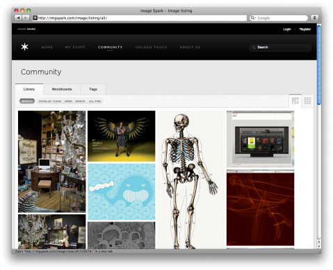
I am a new subscriber to Image Spark a site that allows you to compile and collect images that you've found inspirational on the web. There is a plug-in for Firefox too that makes tagging images pretty easy. I just joined and have only just begun exploring, but I like that I don't need to pull images onto my desktop anymore. I can have my own personal inspiration site filled with images that I use to keep me creative. You can view my current collection here.

via swissmiss

Yanko Design Web Mag

In my browsing for upcoming technology and retail environments, I came across a site for new product design. Yanko design  is a web magazine that compiles the newest advances in modern international design, mostly exhibiting exhibition design, industrial design, product design and new technology. Most designs are concept designs waiting to be picked up by larger industries. Set up like NotCot or It's Nice That, the actual website shows snap shots of designs before delving into multiple pictures and full explanations of products.

and the stuff on there is so cool.

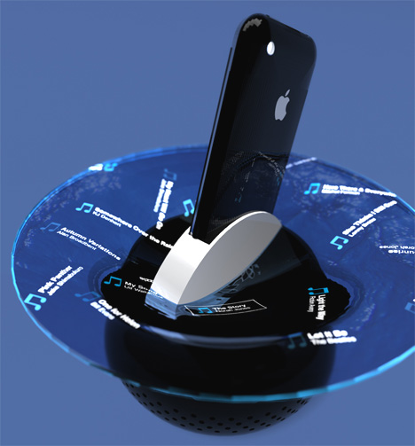
like the iAcqua iPhone Dock designed by Mac Funamizu


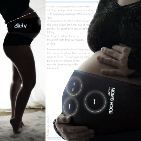
or the Baby Mozart designed by Geof Ramsey


love all of this work

Animatronic Dog

thanks Hartmut...

this is insane!

Monday, April 20, 2009

The New York Trilogy

I've finally begun doing stuff for my portfolio - yay. It only took my two weeks to get started. I am not really rolling yet, but I am thinking, which is the first step to rolling.
I started to do some more research concerning The New York Trilogy, being I really like the books and would like to redesign the covers I designed for Hank's class, since I pretty much did those all in one day! I remember having read a really helpful review on The Book Design Review about how The New York Trilogy is oftentimes pigeon-holed with images of the empire state building on the cover. Meanwhile the glory of The New York Trilogy is the psychology of the characters in their space. Design Observer's guest blogger wrote it best, "The urban unconscious is structured as language and pattern. Space is a character." 
 "Cities are accident machines, generators of random encounters with people, places, objects, and self. Life as lived or constructed builds a narrative route through this collusion of unexpected and familiar events."
Michael Sorkin, I think, is right on. Auster's work appears simple, but characters struggle and are faced with enigmatic consequences to their own existence. I'm revitalized to redesign my covers, and reinspired by some art.


Let's begin

STA Travel facelift?

STA Travel has gotten a new and trendy facelift. I noticed it today as I was entering their "30 Days of Free Travel" contest (although, I never win anything). The new logo marked the beginning of the contest, and the beginning of a more "playful" logo geared towards young travelers who are not looking for the traditional travel experience, or gothic typeface apparently.

As well intentioned as it seems, I am not terribly attracted to the new logo. I find it trendy and busy, following the "lets put something on its side" trend that many logos are doing (see below). I only hope that this helps them find the new cool vibe that they felt their old aesthetic was lacking. What do you think?
old:

new:


trendy sideways logo revamps:


I hope my tip makes it onto Brand New