Micro-art.
Thanks John

Wednesday, December 3, 2008
Monday, November 24, 2008
Wednesday, November 19, 2008
Pandora advertisements

So here I am listening to Pandora as I am doing work, and get totally side tracked by the way advertisers have created experiences on the web instead of dinky little side bars and banners. Check it out (I was kinda impressed):
Tuesday, November 18, 2008
Saturday, November 15, 2008
No Branding Branding
So, I know I am a little delayed, but I just came across this project that Target had going on in NYC called Bullseye Bodega - They set up kiosk stores around Manhattan and featured designers at Target prices for only four days (limited time engagement). The whole point was to re-establish brand loyalty by addressing the needs and concerns of the consumer in this current slow economic period. This also seemed to show consumers that Target is a brand that finds targeted products for their consumers.
I think it was smart.


This new type of branding is interesting.
I noticed that something similar is happening with McDonalds in Japan. They've opened up stores called "Quarter Pounder" where they are only selling QPers with or without cheese. There is no McDonalds branding anywhere, no golden arches, no yellow and white and red. They've stripped down the Branding and the colors to that it is simple message, simple food, simply good.


I love this striping down of branding that is going on - it is also questioning the integrity of products. When economy is slow, it is product integrity that makes people purchase. You buy what you know works, what you know to be true, and these companies are doing that. I think that that is what Starbucks was trying to do with their limited time only logo, but they need to strip down more than that and recognize that their product has become iconic. Go back to basics.
I think it was smart.

This new type of branding is interesting.
I noticed that something similar is happening with McDonalds in Japan. They've opened up stores called "Quarter Pounder" where they are only selling QPers with or without cheese. There is no McDonalds branding anywhere, no golden arches, no yellow and white and red. They've stripped down the Branding and the colors to that it is simple message, simple food, simply good.
I love this striping down of branding that is going on - it is also questioning the integrity of products. When economy is slow, it is product integrity that makes people purchase. You buy what you know works, what you know to be true, and these companies are doing that. I think that that is what Starbucks was trying to do with their limited time only logo, but they need to strip down more than that and recognize that their product has become iconic. Go back to basics.
Sunday, November 9, 2008
Method Baby
When I was at Toys 'R Us yesterday, I ran into some of Method's packaging for babies, and thought it was too cute and wanted to share my photos (and other people's better photos).
I really love Method's stuff, and now I see that you can get it outside of Target, which is neat!


I really love Method's stuff, and now I see that you can get it outside of Target, which is neat!

Friday, November 7, 2008
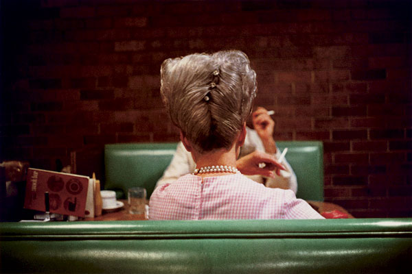
William Eggleston

As you all probably know, I have been collecting and sending postcards forever (and now via Postcrossing) And I bought this image as a postcard years ago. Then I randomly started to accumulate more and more postcards of photographs with this aesthetic, never realizing that they were all photographed by William Eggleston. Now he is having a retrospective at the Whitney from Nov. 7 until Jan. 25....and I am dying to go. So I will be needing to take a random flight home in January to see it!!!

Photoshop CS4
Photoshop CS4 promo stuff via wandaaaa's flickr
How fun!!!
Campaign is called "as real as it gets"
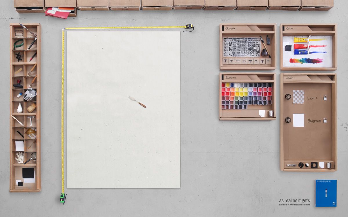
taa-daa ...initiative poster work for software-asli.com
creative director : hendra lesmono
art director : andreas junus & irawandhani kamarga
copywriter : darrick subrata
photgrapher : anton ismael
and them setting it all up for the photograph:
via swissmiss
How fun!!!
Campaign is called "as real as it gets"
taa-daa ...initiative poster work for software-asli.com
creative director : hendra lesmono
art director : andreas junus & irawandhani kamarga
copywriter : darrick subrata
photgrapher : anton ismael
and them setting it all up for the photograph:
via swissmiss
Wednesday, November 5, 2008
Parish Foods
Is it sad that I want to go here because of its website!!!
I mean...it is so pretty, though it doesn't make total sense - do they serve frogs? :)
teehee
CMYK

Research for my most recent packaging assignment led me to the coolest (and cutest imagery) that I thought I would share with you


Tuesday, November 4, 2008

Sunday, November 2, 2008
Treeson & Ren / Fred Design
These little guys are so cute...cuter than some of kidrobot's creations. I want one!!!
 via milkjar
And I love these guys at Fred Design...I mean...who doesn't need this?

Friday, October 31, 2008
Poladroid Project
Wow...digital polaroids now exist - and the interface is pretty neat....only for MACs right now suckas!! Meet Poladroid.
Basically you drag and drop images into the Poladroid Polaroid and voila....there is even a video.
Now all they need to add are effects (meaning smudging, light leaks and the sort). Still in Beta, but fun as hell - and all the information is in French. How posh!
via Flavorwire
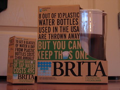
I won last week's "project packaging"
We had to package water filters. The requirements: one diecut, an image (either illustration or photograph) of the product and must address environmental concerns.
I guess my package created the most waste compared to my peers, because it is encased in packaging....but all the paper is recyclable (in theory) and the concept is that the packaging acts as an aide for Brita and Nalgene's Filterforgood.com campaign. So the packaging is helping to make people make less waste...and hopefully they will recycle or reuse my package....I only had a week SO I'm sure I could make it make more sense....and the copy totally needs work!!!
But I did it....no immunity tho. I guess no one gets aufed either!!!
Pretty, old type

So, research for next week's project packaging lead me to this site.
These come from a 1927 edition of Studio Handbook by Samuel Welo - and apparently every page was handlettered by Welo. The pages show beautiful hand done type and various personalized type treatments.
And then there are elements that are so dated it is cute. He goes over what a balanced and well thought out layout looks like (centered and stacked) and goes over "panels"- which are basically those beautiful flourishes you find around type, or plaques.
And then I love his comment on trademarks: "Some of the best TradeMarks are those which use combinations of letters or abstract symbols with no attempt to strive for illustrative material. It is gratifying to note the remarkable amount of clever study that goes into the design of the tradmarks today. The fact is important that few designers have let their striving for beauty run away with the 'utility' of thought"
take a look:


(via CreativePro.com)
Friday, October 24, 2008
Gecko Traders

Was doing some research for Carmen's packaging class about water, and, as always, got side tracked to reusable eco-friendly bags issued by Gecko Traders (via. reusablebags.com).
They are 100% recycled from rice and feed bags that were originally used for transporting goods in Cambodia. The bags are also Fair Trade Certified, which means that the Cambodians who produce these bags are guaranteed a living wage.
What I also like about them is that they are one of a kind and so colorful. And they come in 3 sizes....Market, Wave and Koren

Smiley Perfume
So when I was at work I noticed Smiley Perfume and was absolutely amazed by the scent (musky and yummy) and also the packaging. It comes in a styrofoam cut out that it rests in...since the bottom is rounded. The actual box has braille writing, and all the type is embosed. Gotta check out Happy Therapy


Sunday, October 19, 2008
Mad Men, Mad type

found some really intense articles online about the typographical treatment made by the Mad Men crew. Seems a lot of their type choices wouldn't have been available in the early 1960's.
I think it is remarkable that someone took the time too look this all up, or new it all off hand!!!
here is one article....and the other
Saturday, October 18, 2008
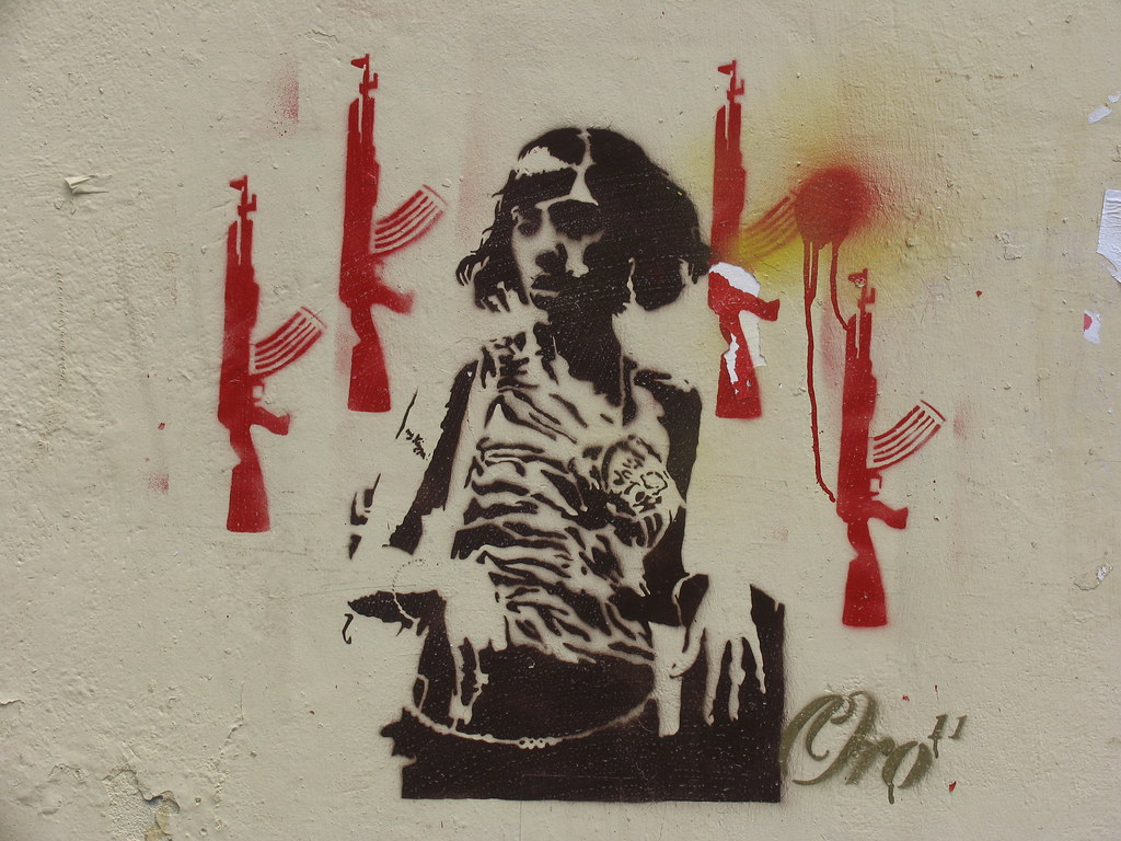
Buenos Aires Graffiti
some research for my music revolution website...thought I would share:
And also some imagery that was interesting to me...
 >
>
Friday, October 17, 2008
826
I've always been fascinated by the 826 revolution (Dave Eggers's non-profit tutoring and reading group) that has swept across the country. When I was at UofM I almost interned at 826Michigan....but didn't find the time. Then, as soon as I entered design, I wanted to contribute visually to 826....and now I see that there is the potential to do so...as Office just did for 826Valencia.
In order to set up shop as a tutoring studio in the location they choose, 826Valencia needed to have a retail possibility (the area was zoned for retail). SO...they decided to create a pirate supply store! These are the designs Office did for their new product line!


 and they have posters also designed by Office.
check it out:
and they have posters also designed by Office.I am envious!!!
Wednesday, October 15, 2008

Friday, October 10, 2008


Awesome Packages
Thanks to The Dieline, a lovely array of packages for inspiration.
Simple but beautiful popcorn packaging, using simple photography in order to show the qualities of the popcorn:


Subscribe to:
Comments (Atom)