while flipping through my blogs today I came across
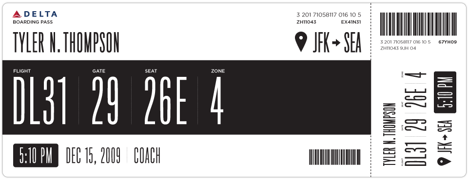
Boarding Pass/Fail which is a personal project for designer
Tyler Thompson to redesign the boarding pass so that it is less confusing, more straight forward and prettier (as is always a goal for the designer).
I found this initiative very interesting because I fly all the time, and when I was at the AIGA memphis conference I attended a very similar presentation by David Gibson of
Two Twelve about issues with USPS's "sorry we missed you" form - and how confusing and terribly put together that is. Design in the public sphere is sadly overlooked making everyday things - such as post office slips and boarding passes - difficult to understand and decipher. Form and function people...form and function.... and that's exactly what Tyler Thompson's newly designed boarding passes are attempting to do.
Similarly, his buddy Dustin Curtis took a stab at redesigning the American Airlines homepage to make that more understandable too... see
here.
If you are having difficulty coming up with some New Years Resolutions, Monina Velarde's
website will give you a few ideas. And I think that the website is pretty - simple, mustard yellow with cute type.


This is a
fun website to peruse - The Dollar Dreadful. Fun type - and I have no idea what the booklets really are....if someone wants to buy one and tell me, please let me know.

fun type from
Village - a place to purchase type from lesser known
type foundries, such as Feliciano and Type Supply.
And one day, when I have the money and time to redesign my house so that it doesn't just look like a hodge podge of crap, I will want to emulate
Emma's aesthetic per
Graphic Exchange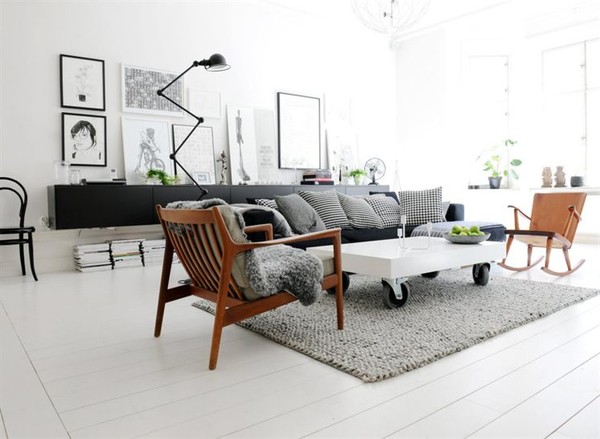
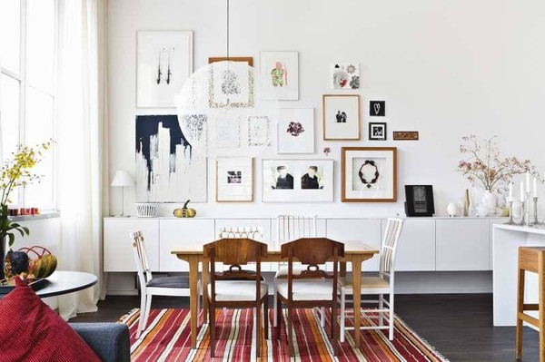
any maybe buy my furniture from
here.


