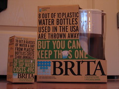
So, research for next week's project packaging lead me to this
site.These come from a 1927 edition of Studio Handbook by Samuel Welo - and apparently every page was handlettered by Welo. The pages show beautiful hand done type and various personalized type treatments.
And then there are elements that are so dated it is cute. He goes over what a balanced and well thought out layout looks like (centered and stacked) and goes over "panels"- which are basically those beautiful flourishes you find around type, or plaques.
And then I love his comment on trademarks: "Some of the best TradeMarks are those which use combinations of letters or abstract symbols with no attempt to strive for illustrative material. It is gratifying to note the remarkable amount of clever study that goes into the design of the tradmarks today. The fact is important that few designers have let their striving for beauty run away with the 'utility' of thought"
take a look:


