Wednesday, December 23, 2009

Dec. 23 inspiration

The day before a holiday is always a slow day at the office - but for me, it has given me an opportunity to catch up on my design reading...and share a few things:

The Summer Basel workshop on typography

The Webble! It's a footrest that gives you "360 degree movement," which would be really great for me at work considering I am sitting for about 7-8 hours a day. I know its sounds super nerdy, but my lower back and ass are telling me that a little leg movement would be a great thing.

A book of 826 National's designed wares. I'm a huge supporter of 826 and have blogged about them numerous times. In Michigan, I was just a fan because I loved what the organization was doing with creative writing for children...now, as a designer, I am inspired by the random and silly creations that are designed and created both for and by 826. I would love the opportunity to contribute at some point!

Concept for a fully recyclable cell phone for Nokia

more tchotchkes for me to collect

The designer Camilla Lillieskold, who has some beautiful work.

Brion Hopkins and Leigh Miller wedding photography.


The London Underground Typeface Explained

And, of course, and interview with Paul Auster about 'Invisible'...the next book on my reading list.

Happy Holidays everyone

Monday, December 21, 2009

Dec. 21 inspiration

this amazing intro to Stephen J Cannell's productions. Love the logo.

Designs by Michael Freimuth


illustrations from Happy Lovers Town


Design work from Albertson Design

illustrations from Robert Samuel Hanson


amazingly intricate and complicated love story of a couple on their wedding invitation from Metal Mother Design

beautiful calligraphy work from Neither Snow

Monday, November 30, 2009

Wednesday, October 28, 2009

List of things I saw today

I've realized, now that I am working 8-6 (or as you can see, 8-7!) that I don't really have enough time to ponder or create a full blog unless I do it when I go home (I don't even touch the computer once I am home though). So, instead, I thought it might be nice to at least have a fast rundown of all the fun things I ran across while I was researching, considering, thinking, or eating lunch.

When researching about creating a holiday card for a client I came across this fun site for wooden printed goods some of which were very cute
also found a neat illustrator trick for making wood textures

then I ran across there very fun and quirky illustrations for Wayne Pate while reading a cute little blog called Modern Craft. Modern Craft has a whole bunch of beautifully hand done illustrations and designs and a whole bunch of give aways....anywho, Wayne Pate's posters embody the cool retro aesthetic always gets our attention and are a bit reminiscent of Lyle Lyle Crocodile, Alexander Girard, and a little David Hockney.

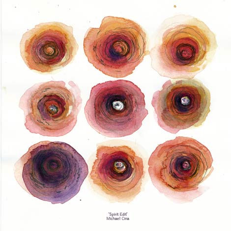
I also ran across this beautiful piece of art on Grain Edit which is for Mike Cina's jazz mix. Mike Cina works with YouWorkForThem.

then I found another fun blog Black*Eiffel...which I recommend checking out for anyone who likes a little design and lifestyle.

Ok...I missed a bunch. But I need to get home...it's getting late.

Monday, October 5, 2009

Maurice L. Freedman


I ran across Maurice L Freedman's work today while doing research at work at ButDoesItFloat and was amazed by his work and the nature of his work.

Maurice L Freedman was the district camoufleur in Florida during World War I. During the First and the Second World Wars, many ships were camouflaged with Dazzle Patterns. This was true for both the Merchant Navy as well as for the Military Navy. Vessels from both the UK and the US were camouflaged. Dazzle is a disruptive type of camouflage used in World War I to camouflage ships against German U-boats. The disruptive design resembled Cubist paintings and confused German U-boats on the speed and direction of a ship.

The top-secret nature of camouflage during World War I has made Dazzle one of history's hidden gems - and what beautiful gems indeed.

Maurice Freedman later went on to graduate from RISD - there was a recent symposium about his work.

Sunday, October 4, 2009

Typodermic


I was looking around myfonts.com and came across a bunch of fonts by Typodermic.

Check em out

Thursday, August 27, 2009

Georges Barbier

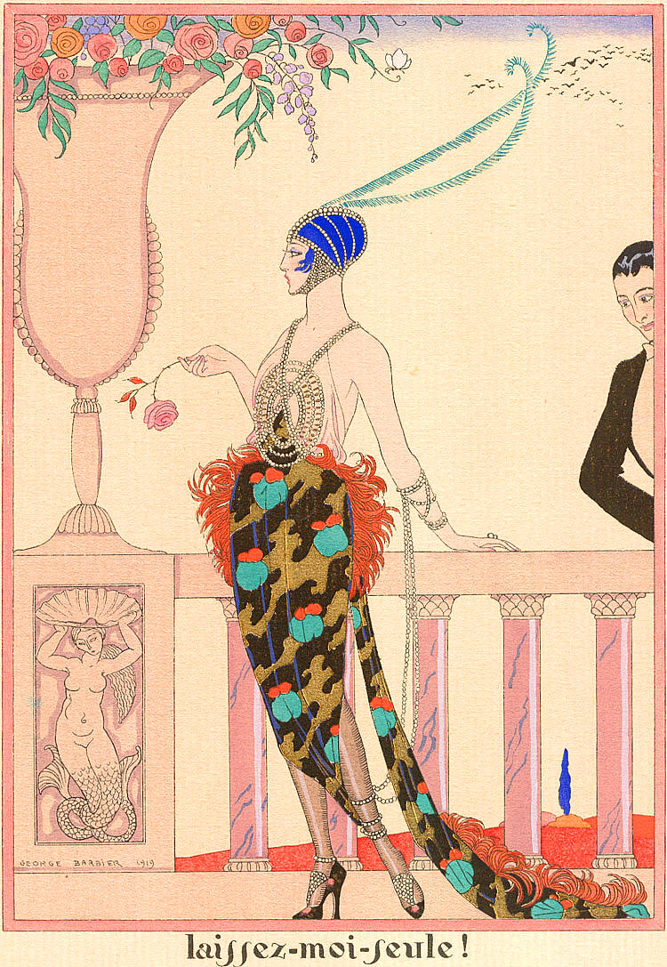
I remember the first time I stumbled upon this image, I was so in love with her that I created an inspiration folder just to keep her on my desktop...that was about 4 years ago, before I had entered design or art.
I have always been a collector, and she was the beginning of a quest to figure out her origin. Today I discovered it. This is the cover illustration for the second edition of a french novel, Les Liaisons Dangereuses, written by Pierre Ambroise Francois Choderlos de Laclos. The original epistolary novel was written back in 1782, just before the French Revolution. Although he was an army general throughout Louis XIV's campaigns, this novel has been likened to those of the Marquis de Sade due to the main characters' use of sex as a vehicle for humiliation.
Almost 125 years after Choderlos de Laclos's bones were thrown into the sea by the Italians who had reclaimed the concurred land from the French Revolution, Les Liaisons Dangereuses was republished with illustrations by Georges Barbier, giving Choderlos de Laclos the posthumous fame he had always desired.
Georges Barbier's illustrated everything from play and poster illustrations, to haute couture design. I found a little autobiography here and here. His depiction of the woman was very iconic to the 1920's, with thin androgynous bodies and beautiful details. His work just screams art deco to me, and I love it.


You can see how work like this inspired artists such as Tomer Hanuka whom I also love.

Wednesday, August 26, 2009

Back to research


It has been a long time since I've posted anything...but I have very recently graduated from The Portfolio Center, and I think it is time to start keeping track of all the inspirational websites, artists and activities that I will be doing while I job search.

First off, came a huge blog reading fiasco. I subscribe all of my blogs to Google Reader, but once in a while I would like to look at new designers or people who do as I do, and read other blogs for inspiration, and then blog about it!!

So I discovered design work life. Design work life is the blog of Seamless Creative which is kept to catalog design inspiration. Seamless Creative is a nice little two person boutique design firm in Queens that does really beautiful but simple work for print and web. Their work has a lot of pattern and simple illustrations, with beautiful choice of color and type.
See below one of their projects.


I think I will keep up on them, especially since they make such simple work look very delicate and polished.

Thursday, July 30, 2009

Bing.com

Bing.com is Microsoft's response to Google and it is running on a pretty strong platform - "Not just a search engine, but a decision engine." Basically, Bing.com is trying to fix internet searching to provide results that are appropriate to the original search (because Google will retrieve the most random results at times.)
Google has also been chastised for not being the most user friendly or aesthetically pleasing website, having been developed before web design and hierarchy were as important as they are now, but unwilling to change their aesthetic and get all their users in an uproar.
So with all these possible improvements that Bing.com could implement, does it live up to our expectations? I thought I would check it out.
I was not satisfied with the results that I found, especially in the image search. The options for looking for varying sizes is a lot more limited than Google (a huge issue for me as I am searching for images that can blow up to print quality). I also don't like the categories that were created for "easier searches." I realize that while those may be the most popular categories, there are more than a few important categories missing - are we really only news, travel and shopping?
Although I have a problem with the functionality of the site, I have to say, it is very pretty. I love the option of having larger thumbnails in the image search. And the inclusion of sections and hierarchy on the search homepages - but does the site work if it is just pretty and not really functioning in a new and better way than Google? Overall, I have to say that I think I will continue to use Google - who needs design, when all I am looking for are results?

Tuesday, July 7, 2009

Remembering Michael


People used to go out and buy newspapers on days of special events. For example, I tried to buy a NYTimes when Obama was elected as our President, but they were sold out everywhere. (Now you can buy one on ebay!!!)

When MJ recently passed away - I figured the same thing would happen. So I decided to do the next best thing - screenshots of the NYTimes homepage. But does this equate or was I just lazy? The interesting thing about online media is that is updates itself so quickly and frequently, that it is the best source for current updated information anyhow. Also, within the first 24 hours, there were more photographs on the NYTimes homepage than I think they had published in their newspaper - so which version is more valuable? On ebay, MJ's paper is more expensive that Obama's. But I got a screenshot of the first NYTimes story.


Friday, July 3, 2009

NYTimes Advertisement & Tufte


Lately, advertisers have been trying to create innovative ways to engage audiences in their web banners. We see that with Pandora, the entire surrounding web space turns into advertiser art as campaigns becomes oftentimes interactive and interesting in an obtrusive but friendly way. The New York Times has also been a member of this group - creating web banners that break the boundaries of their boxes and spill out onto the page. As much as we don't like to be told what to like and what not to like, I've actually been taken in by some of these approaches - especially when done well and when the advertisers are contextually relevant (as my friend Aymar writes).

But today I encountered the counter opposite of the now expected glitzy, complex and overwhelming web add. Edward Tufte, a man who I highly respect and whose books I own, is having a National Tour about information and data presentation. I discovered this via an advertisement on the NYTimes homepage - an advertisement that resembled newspaper ads from the turn of the century (20th Century).


I frankly enjoy the very straight forwards typographical approach - I also found the advertisement extremely striking. The typography, while not too interesting (centered and kerned out a little), is very elegant. And despite there being a lot of information in the ad, I did not find it overwhelming. To see such a shift in a major advertisers methodology towards a very graphical, conservative and yet modern approach (in its minimalism), and, also shifting focus from being catchy to focusing on information and type, is very interesting. It makes me wonder if advertisers are going to start giving us some credit and not necessarily treat people like we need flashing lights and dumbed-down messaging in order to understand content.
Kudos NYTimes and Edward Tufte - keep it up!

Monday, June 22, 2009

Font vs typeface


Today I had a discussion with a guy who works making professional signage - when I say make, I mean design and execution. He said he gets a project, gets ideas from the client, and then creates appropriate wayfinding signs in order to make the client happy. He was telling me all about how his day will differ between working on the computer and designing the sign, to welding and putting the sign together.

Then I asked him, does he happen to create signs with a specific typeface most frequently. And he just looked at me with a blank stare. So I said again,"What is your favorite typeface, you know, for your signs?" Again a blank stare. I tried again, this time just saying type and simplifying the sentence. Still nothing. So then I changed my language - "Do you use a lot of different fonts?" bingo.

"Oh yea, all the time, we get discs of fonts. I have to font match a lot, you know...recognize what font something is..."

This is where he lost me. From what I recall, working on a PC, there are 3 typefaces - or fonts: Times New Roman, Courier, Arial. Fonts, as I know them, are type for the web, faces that aren't loved by designers, or not created by type bureaus (although there are type bureaus called fontfont, thefontshop etc.) Which raises the question, just because he didn't know the word typeface, does that mean he doesn't know type? I didn't really ask any further, but this made me think about the communication rift that I've heard about between designers and everyone else.

And truly, what is the difference between a font and a typeface? Maybe AIGA knows or the Font Feed.

Wednesday, June 17, 2009

more abbreviations

I don't think I would want to say "HoJo" aloud - sounds like a hooker's name!

Wednesday, June 10, 2009

Pandora advertisements Part II

I kinda like this Dave Matthews ad that I saw on Pandora the other day - still impressed by Pandora's advertisements.

Then there are those Apple advertisements on the NY Times that are pretty neat - way to be breaking boundaries and boxes.

Friday, June 5, 2009

Gogo gadget go-be-do-can-go-be achew!


BogoGogo, Bedo, Go.Do.Be - it seems that mottos, taglines, and company names have hopped onto the two letter active verb train to create trendy identities these days. I understand the impetus behind the trend, but I think it has gotten a little out of hand, especially since the only initial difference between two completely different companies that have totally different purposes is one letter in a company name.

oh my!

Sunday, May 31, 2009

1999


It's hard to believe that it has been almost ten years since the dreaded Y2K fiasco that never occurred.

Wednesday, May 20, 2009

Life before Death

i stumbled upon the following site today and was utterly fascinated. 

Roland Barthes says that a photograph is a referent to a moment that has past, and therefore is representative of a time that will never exist again - it has passed us by. But for the dead, does photography do the opposite, and immortalize their presence in a specific moment for all time?

I looked through these photographs and couldn't keep posing this question, because I was side tracked by the dead's skin and how is slips off the face like a loose glove. 

Monday, May 18, 2009

Portfolio Box and Cover Hell!!

So, I got an email while I was in Miami that I need to decide what size my book will be - by today! Awesome. So I figured I would look at some other books online and see what others have done. I'm not so sure about getting one of those large ass boxes, so I wanted to see other options.

from here


from here


from here

Wednesday, May 6, 2009

Milk packaging

I'm doing a little research on milk packaging - because for some reason, I think it would be fun as a student project to try to package something that everyone buys. 

People should design the staples just as much as the specialty items. Despite the fact that the Tropicana redesign was a debacle, I am still appreciative that they were considering a modern upgrade. And because orange juice is such a highly used item, the response to the redesign was amazing. That wouldn't have happened if it had been a lesser used product such as granola or a cereal box. I wonder what would have happened if it was Mott's apple juice! hm.

all via theDieline


Saturday, May 2, 2009

Threadless


I've always been a fan of threadless but I've never had the courage to buy anything. Although I kindof want this shirt! I may spring for it.

Thursday, April 30, 2009

Five Seasons Brewery Westside


I am so excited. My favorite local Atlanta restaurant is finally opening on Marietta St in Atlanta - so I don't have to drive all the way out to Sandy Springs. Its official opening date is May 5.

Just needed to blog my excitement!

Tuesday, April 28, 2009

Mark Weaver


This dude is incredibly talented. I love the way he merges images in a surreal way to create dynamic compositions that are just stunning.

I have seen his work before, but somehow every time I am on ffffound.com or flickr.com I happen to stumble upon more of his work. I believe he is Atlanta based and it seems that he does a lot of layout and illustration design for Paste Magazine.

Mark, wherever you are here in ATL (or Decatur), I am shouting out to you to say "You Rock"


While doing my Mark Weaver research I stumbled upon  Scott Hansen's blog iso50. Scott is a musician and artist living and working out of San Francisco. His music is pretty rad - check it out.