

Wednesday, January 13, 2010

Monday, January 11, 2010

God's Gonna to Cut you down / Run On
I was watching Walk the Line when the SouthLAnds commercial came on with the most magnificent song. Did some research - Johnny Cash's version of "run on" or "God's gonna cut you down" - a traditional folk song, typically played with more lively rifs. But since I am more melancholic than chipper, I prefer the Johnny Cash version - you tell me which you prefer.
Commercial Type

So what do you think of the use of Neutraface for Wendy's? Or Archer for Aflac and Well's Fargo? Is that taking a good thing and beating it to death like Helvetica, or even Papyrus (in the days that it was a new font) or is it a representation that people are starting to notice and value good type? When does a good thing turn sour with respect to typefaces and fonts - is it overuse or misuse and where does one draw the line?
Sunday, January 10, 2010
Today's research
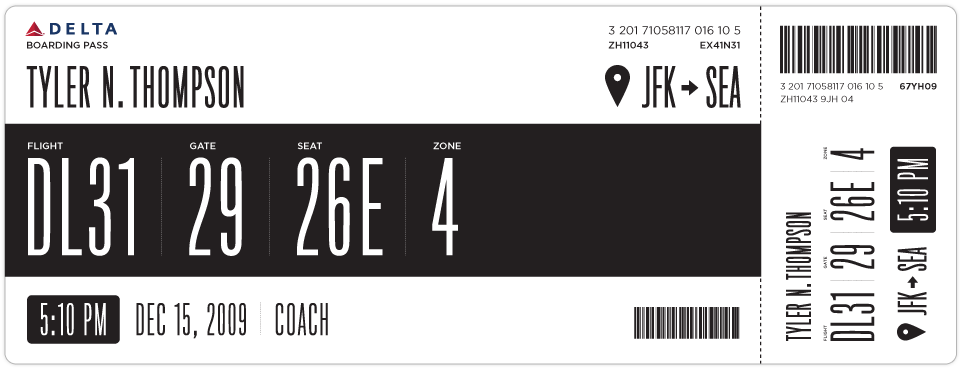
 while flipping through my blogs today I came across Boarding Pass/Fail which is a personal project for designer Tyler Thompson to redesign the boarding pass so that it is less confusing, more straight forward and prettier (as is always a goal for the designer).
 I found this initiative very interesting because I fly all the time, and when I was at the AIGA memphis conference I attended a very similar presentation by David Gibson of Two Twelve about issues with USPS's "sorry we missed you" form - and how confusing and terribly put together that is. Design in the public sphere is sadly overlooked making everyday things - such as post office slips and boarding passes - difficult to understand and decipher. Form and function people...form and function.... and that's exactly what Tyler Thompson's newly designed boarding passes are attempting to do.
Similarly, his buddy Dustin Curtis took a stab at redesigning the American Airlines homepage to make that more understandable too... see here.
If you are having difficulty coming up with some New Years Resolutions, Monina Velarde's website will give you a few ideas. And I think that the website is pretty - simple, mustard yellow with cute type.
Found new work by design firm Parliament of Owls:

Parliament of Owls is the design work of three designers: Ariana Dilibero, Meg Paradise and Lauren Sheldon.

This is a fun website to peruse - The Dollar Dreadful. Fun type - and I have no idea what the booklets really are....if someone wants to buy one and tell me, please let me know.
Design websites for PTARMAK who did work for The Chop Shop

fun type from Village - a place to purchase type from lesser known type foundries, such as Feliciano and Type Supply.
Antreposhop - very expensive things from Antrepo Design
Speaking of stuff - another great source for tchotchkes - The Curiosity Shoppe.
And one day, when I have the money and time to redesign my house so that it doesn't just look like a hodge podge of crap, I will want to emulate Emma's aesthetic per Graphic Exchange
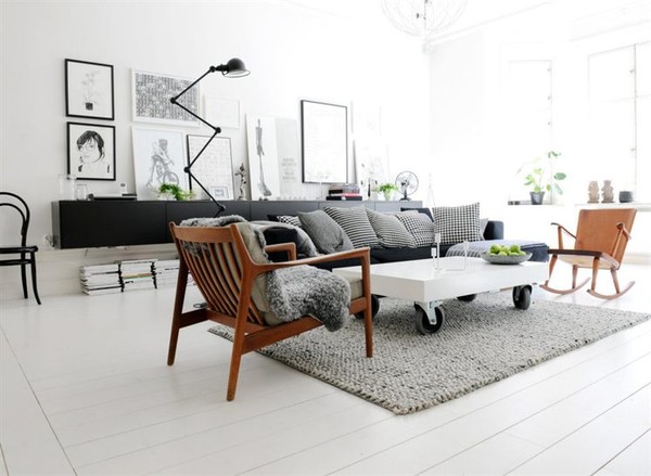
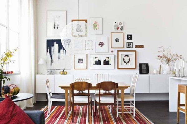
any maybe buy my furniture from here.
Saturday, January 9, 2010
Alexander Girard...plus some

a mini bio of Alexander Girard (1907-1995) from Design Within Reach:
"Art is only art when it is synonymous with living."
There are two certitudes commonly assigned to mid-century designer Alexander Girard: He was the least well-known of the great designers at Herman Miller in the 1950s and 1960s, and he was the greatest colorist and textile designer of modern time. Although seemingly contradictory, both statements are accurate and are a reflection of Girard and the time period in which he worked. During his career, Girard energized the furniture designs of his Herman Miller colleagues with a new, vibrant color palette and an oeuvre of folk-inspired textiles. He was the first modern designer to define textiles as being more than just functional and to further emphasize form through the application of color and pattern.
Born in 1907 in New York City to an American mother and an Italian father, Girard and his family moved back to Italy shortly after his birth. Raised in Florence, Italy, Girard was educated as an architect at the Royal Institute of British Architects in London. In 1932, Girard returned to the United States and opened his first design office in New York City. Five years later, he moved again, to Detroit, where he opened a second studio. His first career breakthrough came in 1949, when he was chosen to design the Detroit Institute of Arts. For Modern Living exhibition, which focused on the design of common items and included the first public display of Charles and Ray Eames's molded plywood chairs. In 1952, Charles Eames recruited Girard to become Herman Miller's director of design for the company's textile division. Girard's tenure at Herman Miller continued into the 1970s and resulted in more than 300 vibrantly hued fabric and wallpaper designs.


 from Maximo
And now there is Sanna Annukka:

Sanna Annukka is an illustrator/designer with a beautiful eye for color, pattern and craft. I've seen here artwork before, but recently was struck by her silkscreened woodblocks, which reminded me very much of Alexander Girard's woodblocks and games. I thought I would share.

Friday, January 8, 2010


Wednesday, December 23, 2009
Dec. 23 inspiration
The day before a holiday is always a slow day at the office - but for me, it has given me an opportunity to catch up on my design reading...and share a few things:
 Concept for a fully recyclable cell phone for Nokia


The Summer Basel workshop on typography
The Webble! It's a footrest that gives you "360 degree movement," which would be really great for me at work considering I am sitting for about 7-8 hours a day. I know its sounds super nerdy, but my lower back and ass are telling me that a little leg movement would be a great thing.
A book of 826 National's designed wares. I'm a huge supporter of 826 and have blogged about them numerous times. In Michigan, I was just a fan because I loved what the organization was doing with creative writing for children...now, as a designer, I am inspired by the random and silly creations that are designed and created both for and by 826. I would love the opportunity to contribute at some point!
 Concept for a fully recyclable cell phone for Nokia
more tchotchkes for me to collect
The designer Camilla Lillieskold, who has some beautiful work.
Brion Hopkins and Leigh Miller wedding photography.

The London Underground Typeface Explained
And, of course, and interview with Paul Auster about 'Invisible'...the next book on my reading list.
Happy Holidays everyone
Monday, December 21, 2009
Dec. 21 inspiration

this amazing intro to Stephen J Cannell's productions. Love the logo.

Designs by Michael Freimuth
illustrations from Happy Lovers Town

Design work from Albertson Design

illustrations from Robert Samuel Hanson

amazingly intricate and complicated love story of a couple on their wedding invitation from Metal Mother Design

beautiful calligraphy work from Neither Snow
Tuesday, December 1, 2009


Subscribe to:
Posts (Atom)