Monday, March 2, 2009

DAYTUM


I've jumped on the DAYTUM bandwagon.

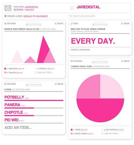
For those of you who don't know what it is, Daytum is a site that compiles daily data. You can track and keep track of anything you do, consume, poop out, who knows.

There are multiple options for viewing, so you can sort your data into pie charts, x and y axis graphs, bar graphs, and counters.

It's an interesting way to monitor yourself in a very objective way - objective and visually stimulating.

The actually site is very minimal, and yet very striking. You can check out how many bowls of cereal I eat a day or my favorite movies to watch when I am designing here

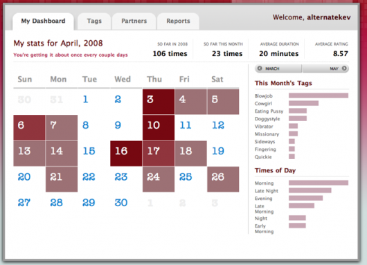
Of course, if you want to be specific and keep track of your sex life, I wouldn't suggest DAYTUM - try Bedpost instead!!!!! (WHAT??) I read about it here and thought I had to see what that was about.

oh my god!!!
Saturday, February 28, 2009

whoa newsmap

I used to think that Newsmap was a unique and interesting visual way to introduce heirarchy and chunking into the news on a broader scale.

And then msnbc introduced Spectra. Granted it is in beta and is a little (a lot) overwhelming, it also is able to create a neat 3 dimensional way to look at news using color to differentiate between subjects. Just read it here.

When you compare the two you find marumushi.com/newsmap to be clunky, dense and old - whereas Spectra is light, bouncy and CRAZY!!!

newsmap:


spectra:

The Song I can't get out of my head

You know when you have something stuck in your head and cannot..CANNOT get it out.
Having that problem with this song. So I thought I would share it with you all.

Thursday, February 26, 2009

we WON!!!

Tropicana will return to its previous packaging...I will be able to find my Low Acid once again.

cha-CHING!!!!

read at nytimes, "Tropicana Discovers Some Buyers Are Passionate About Packaging"

Sunday, February 22, 2009

Online Type

After spending one too many hours perusing The Daily Beast, both reading daily headlines and gawking at some sort of gothic typeface that I couldn't recognize (anyone have any idea? I'm down to Railroad Gothic, Industrial Gothic, Alternative Gothic or Gothic No. 13), I stumbled across a new site called Typesites. Typesites is a weekly showcase of websites with interesting typographic design. It's a fun website - and features some of my favorite visual websites (such as GOOD Magazine, Monocle Magazine, ilovetypography, The New Yorker) and has many I had never heard of.

I suggest checking it out.

Thursday, February 19, 2009

Andrew Holder


Another browsing day.

I think I was looking at a travel magazine (actually Arkitip Magazine) and came across the following artist who produced prints for Andre Balazs properties. I wish I could bring up the names....but that is what happens when you browse randomly and aimlessly-you loose track of where you started :) oops

anywho....Andrew Holder's work has this retro-mod quality to it that I think is really sharp

100th post

this is my 100th post...wow

what the bleep is a humanist type?
find out here

via ilovetypography

Tuesday, February 17, 2009

Drinky Crow

isn't he cute

Pepsi Universe

This is ridiculous

So apparently the Pepsi internal document for the rebrand made its way onto the internet.

Just as a little background: last year Pepsi spent several hundred million dollars on a new logo. 

To prepare for the rebrand, Arnell prepared the 27-page document, titled "BREATHTAKING Design Strategy," to prove that their idea for the new logo is a veritable Da Vinci Code of branding, drawing on everything from magnetic fields to the "Golden Ratio."

I think I vomited a little in my mouth.

Sunday, February 15, 2009